QC3|QC7つ道具(1)層別・パレート図・特性要因図の使い方 QC Level 3 | The 7 QC Tools (Part 1): How to Use Stratification, Pareto Charts, and Cause-and-Effect Diagrams
QC3の試験で必ず出題されるのが「QC7つ道具」です。これは製造現場で発生する問題を解決するための7つの基本ツールで、データを可視化し、原因を特定し、改善につなげるために欠かせません。
A topic that is guaranteed to appear on the QC Level 3 exam is the “7 QC Tools.” These are seven fundamental tools for solving problems that arise in manufacturing settings — essential for visualizing data, identifying root causes, and driving improvement.
この記事では、QC7つ道具の中でも特に重要な「層別」「パレート図」「特性要因図」の3つについて、基本的な考え方から実際の使い方、QC3試験での頻出ポイントまでを詳しく解説します。これらのツールは単独で使うこともありますが、組み合わせることでより効果的な問題解決が可能になります。
This article provides a detailed explanation of three particularly important tools from the 7 QC Tools — Stratification, the Pareto Chart, and the Cause-and-Effect Diagram — covering fundamental concepts, practical applications, and the key points most frequently tested in the QC Level 3 exam. While each tool can be used independently, combining them enables even more effective problem solving.
QC3では、各ツールの定義や目的を問う問題だけでなく、実際のデータを使った作成方法や読み取り方を問う問題も出題されます。この記事を読むことで、試験対策だけでなく、実務での活用イメージも掴めるはずです。
In QC Level 3, questions are asked not only about the definition and purpose of each tool, but also about how to construct and interpret them using actual data. By reading this article, you should gain not only exam preparation knowledge, but also a practical sense of how these tools are applied in real-world settings.
目次
QC7つ道具とは|品質管理の基本ツール The 7 QC Tools | Fundamental Tools for Quality Control
QC7つ道具の全体像 Overview of the 7 QC Tools
QC7つ道具とは、品質管理活動において、データを収集・整理・分析するための7つの基本的な手法です。具体的には、層別、パレート図、特性要因図、ヒストグラム、散布図、チェックシート、グラフの7つで構成されています。
The 7 QC Tools are seven fundamental methods for collecting, organizing, and analyzing data in quality control activities. Specifically, they consist of: Stratification, Pareto Chart, Cause-and-Effect Diagram, Histogram, Scatter Diagram, Check Sheet, and Graphs.
これらのツールは1950年代から日本の製造業で活用され、品質向上と不良削減に大きく貢献してきました。特別な統計知識がなくても使えるシンプルさと、誰が見ても理解しやすい視覚的な表現が特徴です。
These tools have been used in Japanese manufacturing since the 1950s, making significant contributions to quality improvement and defect reduction. Their defining characteristics are their simplicity — usable without specialist statistical knowledge — and their visual presentation, which anyone can understand at a glance.
現代の製造現場では、これらのツールをExcelやデジタルツールで作成することも増えていますが、基本的な考え方と作成手順を理解しておくことは、QC3合格のためにも実務のためにも重要です。
In today’s manufacturing settings, these tools are increasingly created using Excel and other digital tools. However, understanding the fundamental concepts and construction procedures remains important — both for passing the QC Level 3 exam and for practical application.
データに基づく問題解決の重要性 The Importance of Data-Driven Problem Solving
製造現場では「勘や経験」に頼った判断が行われることもありますが、QC7つ道具を使うことで、客観的なデータに基づいた意思決定が可能になります。たとえば「不良が多い」という漠然とした認識を、パレート図で「どの不良が何件発生しているか」という具体的な数値で示すことができます。
In manufacturing settings, decisions are sometimes made based on intuition or experience, but using the 7 QC Tools enables decision-making grounded in objective data. For example, the vague perception that “there are a lot of defects” can be expressed in concrete numbers using a Pareto Chart — showing exactly which defects are occurring and how many times.
データを可視化することで、問題の優先順位が明確になり、限られた人員や予算を最も効果的な改善活動に集中できます。また、改善前後のデータを比較することで、施策の効果を客観的に評価することもできます。
Visualizing data makes it clear which problems should be prioritized, allowing limited personnel and budgets to be focused on the most effective improvement activities. Comparing data before and after improvements also allows the impact of countermeasures to be evaluated objectively.
QC3での出題頻度 Frequency of Coverage in the QC Level 3 Exam
QC3の試験では、QC7つ道具は「手法分野」で出題されます。特に層別、パレート図、特性要因図の3つは出題頻度が高く、毎回の試験で何らかの形で問われると考えておくべきです。
In the QC Level 3 exam, the 7 QC Tools are tested in the “Methods” section. In particular, Stratification, the Pareto Chart, and the Cause-and-Effect Diagram appear with high frequency, and you should expect them to be tested in some form on every exam.
出題パターンとしては、各ツールの定義や目的を問う知識問題、実際のデータからグラフを作成する計算問題、完成したグラフを読み取って改善策を考える応用問題などがあります。暗記だけでなく、実際に手を動かして作成できるレベルまで理解を深めることが合格への近道です。
Question patterns include knowledge questions asking about the definition and purpose of each tool, calculation questions requiring you to construct charts from actual data, and applied questions asking you to read a completed chart and identify improvement measures. The path to passing lies not in memorization alone, but in developing understanding to the point where you can construct each tool by hand.
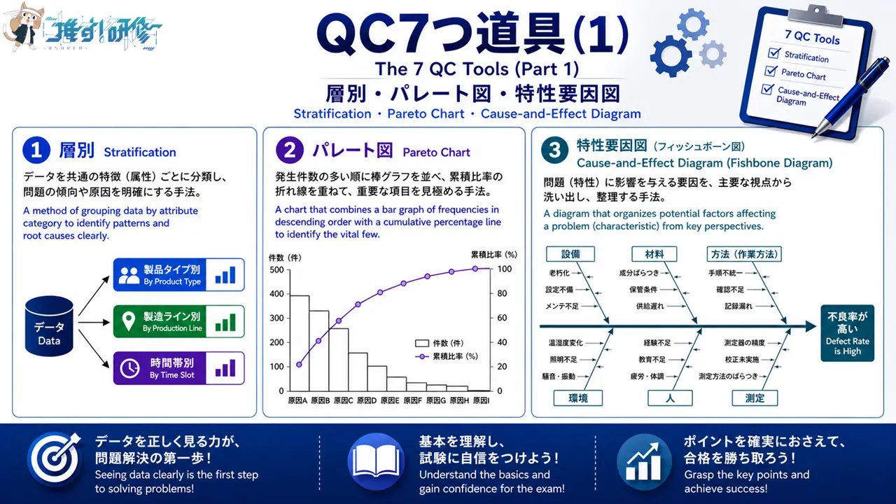
①層別|データを分類して真の原因を見つける ① Stratification | Classifying Data to Identify Root Causes
層別とは何か What Is Stratification?
層別とは、データを特定の基準で分類・整理する手法です。「層別」という言葉は少し難しく感じるかもしれませんが、簡単に言えば「データを分ける」ことです。全体のデータをそのまま見ても原因が分からない場合に、作業者別、機械別、時間帯別、ロット別などの基準で分けることで、問題の真の原因が見えてくることがあります。
Stratification is a method of classifying and organizing data according to specific criteria. The concept may sound complex, but in simple terms it means “dividing data into groups.” When examining overall data fails to reveal the cause of a problem, dividing it by criteria such as operator, machine, time period, or lot can bring the true cause to light.
たとえば、ある製品の不良率が全体で5%だったとします。このデータだけでは「どこに問題があるのか」が分かりません。しかし、作業者別に層別してみると、特定の作業者だけ不良率が10%と高いことが判明するかもしれません。これにより、その作業者の作業方法や教育に問題があるという仮説が立てられます。
For example, suppose the overall defect rate for a given product is 5%. This figure alone does not reveal where the problem lies. However, when the data is stratified by operator, it may become clear that one particular operator has a defect rate as high as 10%. This leads to the hypothesis that there is a problem with that operator’s working method or training.
層別は他のQC7つ道具と組み合わせて使うことも多く、たとえばパレート図を作成する前に層別を行い、複数のパレート図を比較することで、より深い分析が可能になります。
Stratification is frequently used in combination with other QC tools. For example, performing stratification before creating Pareto Charts and then comparing multiple charts enables deeper analysis.
層別の目的と効果 Purpose and Effects of Stratification
層別の主な目的は、バラツキの原因を特定することです。製造現場では様々な要因が複雑に絡み合って品質に影響を与えています。全体のデータだけを見ていても、どの要因が最も影響しているのかが分かりません。
The primary purpose of stratification is to identify the causes of variation. In manufacturing settings, a complex mix of factors influences quality. Looking only at overall data makes it impossible to determine which factor is having the greatest impact.
層別を行うことで、データのバラツキが「偶然によるもの」なのか「特定の要因によるもの」なのかを見分けることができます。特定の層で明らかに傾向が異なる場合、その層に問題の原因が潜んでいる可能性が高いと判断できます。
Stratification makes it possible to determine whether variation in data is due to chance or to a specific factor. When a particular stratum shows a clearly different trend, it can be concluded that the cause of the problem is likely to lie within that stratum.
また、層別は改善活動の効率化にも役立ちます。全体に対して一律の対策を打つのではなく、問題のある層に絞って対策を講じることで、費用対効果の高い改善が実現できます。
Stratification also helps improve the efficiency of improvement activities. Rather than applying uniform countermeasures across the board, focusing measures on the problematic stratum delivers cost-effective improvements.
層別の具体例(製造現場での活用) Practical Examples of Stratification (Applications in Manufacturing)
製造現場での層別の具体例をいくつか紹介します。
Here are some practical examples of stratification in manufacturing settings.
ある自動車部品メーカーでは、塗装工程で色ムラの不良が発生していました。最初は「塗料の品質が悪い」と考えられていましたが、層別分析を行ったところ、午前中と午後で不良率に差があることが判明しました。さらに調査すると、午後は室温が上がることで塗料の粘度が変化していたことが原因だと分かり、温度管理を徹底することで不良を削減できました。
At one automotive parts manufacturer, uneven coloring defects were occurring in the painting process. Initially, poor paint quality was suspected, but stratification analysis revealed a difference in defect rates between the morning and afternoon. Further investigation showed that the cause was a change in paint viscosity as the room temperature rose in the afternoon. Defects were reduced by implementing strict temperature control.
別の事例では、プラスチック成形工程で寸法不良が発生していました。機械別に層別したところ、特定の1台だけ不良率が高いことが分かりました。その機械を点検すると、金型の摩耗が進んでいたことが判明し、金型を交換することで問題が解決しました。
In another case, dimensional defects were occurring in a plastic molding process. Stratification by machine revealed that one particular machine had a significantly higher defect rate. Inspection of that machine revealed advanced mold wear, and the problem was resolved by replacing the mold.
このように、層別は「なんとなく不良が多い」という状態から「どこに問題があるのか」を具体的に特定するための強力なツールです。
As these examples show, stratification is a powerful tool for moving from the vague sense that “there are a lot of defects” to a specific identification of where the problem lies.
層別の実施手順 How to Carry Out Stratification
層別を実施する際の基本的な手順は以下の通りです。
The basic procedure for carrying out stratification is as follows.
まず、層別の基準を決めます。一般的な基準としては、4M(Man:作業者、Machine:機械、Material:材料、Method:方法)や、時間(時間帯、曜日、季節)、場所(工場、ライン、工程)などがあります。どの基準で層別するかは、問題の性質や現場の状況によって判断します。
First, determine the stratification criteria. Common criteria include the 4M framework (Man: operator, Machine: equipment, Material: materials, Method: procedure), time (time of day, day of week, season), and location (factory, line, process). Which criteria to use is determined by the nature of the problem and the conditions on the shop floor.
次に、データを収集します。各層ごとにデータを分けて記録できるように、チェックシートなどを活用します。データ数が少なすぎると傾向が見えにくいため、十分な量のデータを集めることが重要です。
Next, collect data. Use check sheets and similar tools to record data separately for each stratum. It is important to collect a sufficient volume of data, as too few data points make it difficult to identify trends.
収集したデータを基準ごとに整理し、グラフや表にまとめます。棒グラフや折れ線グラフを使うと、層ごとの違いが視覚的に分かりやすくなります。
Organize the collected data by criteria and summarize it in graphs or tables. Bar graphs and line graphs make it easy to see differences between strata at a glance.
最後に、層ごとのデータを比較し、明らかに傾向が異なる層がないかを確認します。差が見られた場合は、その層に問題の原因がある可能性が高いため、さらに詳しく調査します。
Finally, compare the data across strata and check whether any stratum shows a clearly different trend. If a difference is found, there is a high likelihood that the cause of the problem lies within that stratum, so investigate further.
QC3での頻出ポイント Key Points Frequently Tested in QC Level 3
QC3の試験では、層別に関して以下のような問題が出題されます。
The QC Level 3 exam includes the following types of questions related to stratification.
まず、「層別とは何か」という定義を問う問題です。「データを特定の基準で分類・整理すること」という基本的な説明ができるようにしておきましょう。
First, questions asking for the definition of stratification. Make sure you can give a clear explanation: “classifying and organizing data according to specific criteria.”
また、「どのような場面で層別を使うか」という目的を問う問題もよく出ます。「バラツキの原因を特定するため」「他のQC7つ道具と組み合わせて使うため」といった点を押さえておくことが重要です。
Questions about the purpose of stratification — when and why it is used — are also common. Key points to remember are: “to identify the causes of variation” and “to use in combination with other QC tools.”
さらに、具体的な事例を示して「どの基準で層別すべきか」を問う問題も出題されます。たとえば「作業者によって不良率が異なる可能性がある場合、どのように層別するか」といった問題です。4Mなどの一般的な基準を理解し、状況に応じて適切な基準を選べるようにしておきましょう。
Questions presenting a specific scenario and asking which stratification criteria should be applied are also common — for example, “If defect rates may differ by operator, how should stratification be carried out?” Understand common criteria such as the 4M framework, and be able to select the appropriate criteria depending on the situation.

②パレート図|重点課題を明確にする ② Pareto Chart | Clarifying Priority Issues
パレート図とは何か What Is a Pareto Chart?
パレート図とは、データを大きい順に並べた棒グラフと、累積比率を示す折れ線グラフを組み合わせたグラフです。不良の種類別件数、クレームの内容別件数など、カテゴリー別のデータを可視化する際に使います。
A Pareto Chart is a chart that combines a bar graph with data arranged in descending order and a line graph showing the cumulative percentage. It is used to visualize data by category, such as the number of defects by type or the number of complaints by type.
パレート図の最大の特徴は、「どの項目が全体に対して大きな影響を与えているか」が一目で分かることです。製造現場では様々な種類の不良が発生しますが、その中でどれを優先的に対策すべきかを判断する際に、パレート図が非常に有効です。
The greatest feature of a Pareto Chart is that it makes it immediately clear which items are having the greatest impact on the overall picture. In manufacturing settings, various types of defects occur, and the Pareto Chart is extremely effective for determining which ones should be prioritized for countermeasures.
QC3の試験では、パレート図の作成方法だけでなく、完成したパレート図を読み取って「どの項目を優先的に改善すべきか」を判断する問題も出題されます。
In the QC Level 3 exam, questions are asked not only about how to construct a Pareto Chart, but also about reading a completed Pareto Chart and determining which items should be prioritized for improvement.
パレートの法則(80:20の法則) The Pareto Principle (The 80:20 Rule)
パレート図の背景にあるのが「パレートの法則」です。これは「全体の結果の80%は、20%の要因によって生み出されている」という経験則で、「80:20の法則」とも呼ばれます。
Underlying the Pareto Chart is the “Pareto Principle” — the empirical rule that “80% of the overall results are produced by 20% of the causes,” also known as the “80:20 Rule.”
製造現場に当てはめると、「全体の不良の80%は、上位20%の不良要因によって発生している」ということになります。つまり、多くの場合、少数の重要な要因に対策を講じることで、大部分の問題を解決できるということです。
Applied to manufacturing settings, this means “80% of all defects are caused by the top 20% of defect factors.” In other words, in most cases, addressing a small number of vital factors can resolve the majority of problems.
ただし、この比率は必ずしも正確に80:20になるわけではなく、70:30や90:10になることもあります。重要なのは「少数の重要な要因に集中して対策する」という考え方です。
However, this ratio is not always exactly 80:20 — it may be 70:30 or 90:10 in practice. What matters is the underlying idea of “focusing countermeasures on the vital few.”
パレート図を使うことで、この法則を視覚的に確認でき、限られた時間や予算を最も効果的に活用できます。
Using a Pareto Chart allows this principle to be confirmed visually, enabling limited time and budgets to be used as effectively as possible.
パレート図の作成方法 How to Construct a Pareto Chart
パレート図の作成手順を具体的に説明します。
The procedure for constructing a Pareto Chart is explained in concrete terms below.
まず、データを収集します。たとえば、1か月間に発生した不良を種類別に集計します。「キズ50件、寸法不良30件、色ムラ15件、異物混入10件、その他5件」といったデータです。
First, collect data. For example, tally the defects that occurred over one month by type: “Scratches: 50, Dimensional defects: 30, Uneven coloring: 15, Foreign object contamination: 10, Other: 5.”
次に、データを件数の多い順に並べ替えます。この例では「キズ、寸法不良、色ムラ、異物混入、その他」の順になります。
Next, sort the data in descending order by count. In this example, the order is: “Scratches, Dimensional defects, Uneven coloring, Foreign object contamination, Other.”
それぞれの累積件数と累積比率を計算します。キズは50件で累積比率45.5%、寸法不良まで含めると80件で72.7%、色ムラまでで95件で86.4%…といった具合です。
Calculate the cumulative count and cumulative percentage for each item. Scratches: 50 items, cumulative percentage 45.5%; including Dimensional defects: 80 items, 72.7%; including Uneven coloring: 95 items, 86.4%…
横軸に不良の種類、左側の縦軸に件数、右側の縦軸に累積比率(%)を設定します。件数を棒グラフで表し、累積比率を折れ線グラフで表します。
Set the horizontal axis to defect type, the left vertical axis to count, and the right vertical axis to cumulative percentage (%). Represent the count as a bar graph and the cumulative percentage as a line graph.
最後に、累積比率80%のラインを引きます。このラインより左側(累積比率80%までに含まれる項目)が重点的に対策すべき項目となります。
Finally, draw a line at the 80% cumulative percentage mark. The items to the left of this line — those included within the first 80% of the cumulative percentage — are the ones that require priority countermeasures.
パレート図の読み取り方と活用例 How to Read and Apply a Pareto Chart
完成したパレート図からは、以下のような情報を読み取ることができます。
The following information can be read from a completed Pareto Chart.
まず、どの項目が最も件数が多いかが一目で分かります。棒グラフの高さを見れば、最も発生頻度の高い不良が分かります。
First, it is immediately clear which item has the highest count. The height of the bars shows which defect occurs most frequently.
次に、累積比率80%に達するまでにどの項目が含まれるかを確認します。先ほどの例では、キズと寸法不良の2つで全体の72.7%を占めているため、この2つを優先的に対策すれば、大部分の不良を削減できることが分かります。
Next, confirm which items are included up to the 80% cumulative percentage mark. In the earlier example, Scratches and Dimensional defects together account for 72.7% of the total, which shows that prioritizing countermeasures for these two items will reduce the majority of defects.
実際の製造現場では、パレート図を改善前と改善後で比較することも効果的です。たとえば、キズに対策を講じた後にパレート図を作り直すと、キズの件数が減少し、相対的に他の不良が目立つようになります。この繰り返しによって、継続的な品質改善が実現できます。
In real manufacturing settings, comparing Pareto Charts before and after improvements is also effective. For example, when a new Pareto Chart is constructed after implementing countermeasures for Scratches, the count for Scratches decreases and other defects become relatively more prominent. This iterative process enables continuous quality improvement.
また、層別と組み合わせることで、より深い分析も可能です。たとえば、作業者別にパレート図を作成し、比較することで、特定の作業者で特定の不良が多いといった傾向を発見できます。
Combining with stratification also enables deeper analysis. For example, constructing and comparing Pareto Charts by operator can reveal trends such as a particular operator generating a disproportionate number of a specific type of defect.
QC3での頻出ポイント Key Points Frequently Tested in QC Level 3
QC3の試験では、パレート図に関して以下のような問題が頻出します。
The following types of questions related to Pareto Charts appear frequently in the QC Level 3 exam.
まず、パレート図の定義や目的を問う問題です。「データを大きい順に並べた棒グラフと累積比率の折れ線グラフを組み合わせたもの」「重点課題を明確にするために使う」といった説明ができるようにしておきましょう。
First, questions asking about the definition and purpose of Pareto Charts. Make sure you can explain: “a chart combining a bar graph with data in descending order and a cumulative percentage line graph” and “used to clarify priority issues.”
また、実際のデータが与えられて、パレート図を作成する問題も出題されます。データを大きい順に並べ替え、累積比率を計算する手順をしっかり練習しておくことが重要です。
Questions where actual data is provided and you are asked to construct a Pareto Chart are also common. It is important to practice the procedure of sorting data in descending order and calculating cumulative percentages thoroughly.
さらに、完成したパレート図を見て「どの項目を優先的に改善すべきか」を答える問題も出ます。累積比率80%のラインを基準に判断する考え方を理解しておきましょう。
Questions where you are shown a completed Pareto Chart and asked to identify which items should be improved first are also common. Make sure you understand the concept of using the 80% cumulative percentage line as the basis for making this judgment.
計算問題では、累積比率の計算で小数点以下の処理(四捨五入など)に注意が必要です。問題文の指示に従って正確に計算しましょう。
In calculation questions, pay close attention to how decimal places are handled (rounding, etc.) when calculating cumulative percentages. Follow the instructions in the question and calculate accurately.
③特性要因図(魚の骨図)|原因を体系的に整理する ③ Cause-and-Effect Diagram (Fishbone Diagram) | Systematically Organizing Causes
特性要因図とは何か What Is a Cause-and-Effect Diagram?
特性要因図とは、問題(特性)とその原因(要因)の関係を体系的に整理するための図です。魚の骨のような形をしていることから「魚の骨図」、考案者の名前から「石川ダイアグラム」とも呼ばれます。
A Cause-and-Effect Diagram is a diagram for systematically organizing the relationship between a problem (characteristic) and its causes (factors). Because of its resemblance to a fish skeleton, it is also called a “Fishbone Diagram,” and after its creator, an “Ishikawa Diagram.”
パレート図が「どの問題を優先すべきか」を明らかにするのに対し、特性要因図は「なぜその問題が発生するのか」という原因を洗い出すために使います。
While a Pareto Chart clarifies “which problem should be prioritized,” a Cause-and-Effect Diagram is used to identify “why that problem is occurring.”
特性要因図の右端に「解決したい問題」を書き、その問題に影響を与える可能性のある要因を左側に枝分かれさせながら書き込んでいきます。ブレインストーミングと組み合わせて使うことで、チーム全員の知識や経験を集約し、原因の見落としを防ぐことができます。
The problem to be solved is written at the right end of the diagram, and factors that may be influencing it are written as branching lines extending to the left. Used in combination with brainstorming, this aggregates the knowledge and experience of the entire team and helps prevent causes from being overlooked.
特性要因図の構造(4M・5M・6M) Structure of the Cause-and-Effect Diagram (4M, 5M, 6M)
特性要因図を作成する際は、要因を体系的に整理するために「4M」「5M」「6M」といった分類を使います。
When constructing a Cause-and-Effect Diagram, frameworks such as “4M,” “5M,” and “6M” are used to organize factors systematically.
4Mは、Man(人)、Machine(機械)、Material(材料)、Method(方法)の4つです。製造現場で発生する問題の多くは、この4つのいずれかに原因があると考えられます。
The 4M framework consists of: Man, Machine, Material, and Method. Most problems that arise in manufacturing settings are considered to have their cause in one of these four categories.
5Mは、4Mに「Measurement(測定)」を加えたものです。測定器の精度や測定方法の問題が品質に影響することもあるため、より詳しく分析したい場合に使います。
The 5M framework adds “Measurement” to the 4M framework. Since problems with instrument precision or measurement methods can also affect quality, 5M is used when a more detailed analysis is desired.
6Mは、5Mに「Management(管理)」または「Mother Nature(環境)」を加えたものです。温度や湿度などの環境要因、あるいは作業指示や管理体制の問題を明確にしたい場合に使います。
The 6M framework adds “Management” or “Mother Nature (Environment)” to the 5M framework. It is used when environmental factors such as temperature or humidity, or problems with work instructions or management systems, need to be clarified.
QC3の試験では、4Mが最もよく出題されます。それぞれのMに当てはまる具体的な要因の例を理解しておくことが重要です。
In the QC Level 3 exam, the 4M framework is tested most frequently. It is important to understand concrete examples of factors that fall under each of the four M categories.
特性要因図の作成手順 How to Construct a Cause-and-Effect Diagram
特性要因図の作成手順は以下の通りです。
The procedure for constructing a Cause-and-Effect Diagram is as follows.
まず、解決したい問題(特性)を明確にします。「寸法不良が多い」「納期遅延が発生している」など、具体的な問題を一つ設定します。
First, clearly define the problem (characteristic) to be resolved. Set one specific problem, such as “high rate of dimensional defects” or “delivery delays are occurring.”
次に、紙の右端に問題を書き、左から右に向かって太い矢印(背骨)を引きます。この矢印が魚の骨の背骨に当たります。
Next, write the problem at the right end of the page and draw a backbone arrow (the spine) pointing from left to right toward it. This arrow represents the backbone of the fish.
背骨に対して斜めに大骨を引き、それぞれに4M(人、機械、材料、方法)を割り当てます。この大骨が魚のあばら骨に当たります。
Draw diagonal branches (large bones) from the spine and assign each of the 4M categories (Man, Machine, Material, Method) to them. These large bones represent the ribs of the fish.
各大骨に対して、具体的な要因を書き込んでいきます。たとえば「人」の大骨には「作業者のスキル不足」「疲労」「作業手順の理解不足」などの中骨を追加します。さらに、中骨に対して「なぜそうなるのか」を掘り下げて小骨を追加することもできます。
Write specific factors onto each large bone. For example, add medium bones to the “Man” branch such as “insufficient operator skill,” “fatigue,” and “inadequate understanding of work procedures.” Smaller bones can also be added to medium bones by asking “why does this occur?” to drill down further.
チーム全員でブレインストーミングを行い、思いつく限りの要因を書き出します。この段階では、実際に原因かどうかは問わず、可能性のあるものは全て書き出すことが重要です。
Conduct a brainstorming session with the whole team and write down every possible factor that comes to mind. At this stage, it is important to write down everything that could potentially be a cause, regardless of whether it is actually the cause.
最後に、書き出された要因の中から、最も影響が大きそうなものを絞り込み、実際にデータを取って検証します。
Finally, narrow down the listed factors to those likely to have the greatest impact, then collect actual data to verify them.
特性要因図の活用例 Practical Applications of the Cause-and-Effect Diagram
特性要因図は、製造現場の様々な問題解決に活用されています。
The Cause-and-Effect Diagram is applied to a wide range of problem-solving situations in manufacturing settings.
ある食品工場では、「製品の賞味期限内に変色が発生する」という問題がありました。特性要因図を使って原因を洗い出したところ、材料(原料の保管状態)、機械(充填機のシール不良)、方法(殺菌温度の設定)など、複数の要因が候補として挙がりました。それぞれを検証した結果、充填機のシール不良が主な原因であることが判明し、機械のメンテナンスを強化することで問題を解決できました。
At one food factory, the problem was “discoloration occurring within the product’s best-before date.” Using a Cause-and-Effect Diagram to identify possible causes surfaced multiple candidates, including Material (storage conditions of raw ingredients), Machine (faulty sealing in the filling machine), and Method (sterilization temperature settings). Verification of each factor revealed that the faulty seal on the filling machine was the primary cause, and the problem was resolved by strengthening machine maintenance.
別の事例では、「納期遅延が頻発している」という問題に対して特性要因図を作成しました。人(作業者の配置)、機械(設備の故障頻度)、方法(生産計画の精度)などの要因を整理し、特に生産計画の精度に問題があることが分かりました。需要予測の方法を見直すことで、納期遵守率が向上しました。
In another case, a Cause-and-Effect Diagram was constructed for the problem of “frequent delivery delays.” Organizing factors including Man (operator allocation), Machine (frequency of equipment breakdowns), and Method (accuracy of production planning) revealed that the accuracy of production planning was a particular problem. Revising the demand forecasting method improved the on-time delivery rate.
このように、特性要因図は複雑に絡み合った問題の原因を整理し、チーム全員で共通認識を持つために非常に有効なツールです。
As these examples show, the Cause-and-Effect Diagram is an extremely effective tool for organizing the causes of complex, interrelated problems and building shared understanding across the entire team.
QC3での頻出ポイント Key Points Frequently Tested in QC Level 3
QC3の試験では、特性要因図に関して以下のような問題が出題されます。
The following types of questions related to the Cause-and-Effect Diagram appear in the QC Level 3 exam.
まず、特性要因図の定義や別名を問う問題です。「問題とその原因の関係を体系的に整理する図」「魚の骨図」「石川ダイアグラム」といった用語を覚えておきましょう。
First, questions asking about the definition and alternative names of the Cause-and-Effect Diagram. Memorize terms such as “a diagram that systematically organizes the relationship between a problem and its causes,” “Fishbone Diagram,” and “Ishikawa Diagram.”
また、4M・5M・6Mの内容を問う問題も頻出です。それぞれのMが何を意味するか、具体的にどのような要因が含まれるかを理解しておくことが重要です。
Questions about the content of the 4M, 5M, and 6M frameworks are also frequently tested. It is important to understand what each M stands for and what specific factors fall under each category.
さらに、具体的な問題が示されて「どの要因を大骨に書くべきか」「どのMに分類されるか」を問う問題も出ます。たとえば「作業者のスキル不足」はMan(人)、「金型の摩耗」はMachine(機械)に分類されます。
Questions presenting a specific problem and asking “which factors should be written on the large bones” or “which M category does this fall under?” also appear. For example, “insufficient operator skill” is classified under Man, and “mold wear” is classified under Machine.
特性要因図は他のQC7つ道具と組み合わせて使うことも多く、「パレート図で重点課題を特定した後、特性要因図で原因を洗い出す」という流れを理解しておくと、応用問題にも対応できます。
The Cause-and-Effect Diagram is frequently used in combination with other QC tools. Understanding the workflow of “using a Pareto Chart to identify priority issues, then using a Cause-and-Effect Diagram to identify causes” will also help you handle applied questions.
3つのツールの使い分け|どの場面でどのツールを使うか Choosing Between the Three Tools | Which Tool to Use and When
層別・パレート図・特性要因図の比較表 Comparison Table: Stratification, Pareto Chart, and Cause-and-Effect Diagram
3つのツールの特徴を表にまとめると以下のようになります。
The characteristics of the three tools are summarized in the table below.
| ツール Tool | 目的 Purpose | 使う場面 When to Use | 得られる情報 Information Obtained |
|---|---|---|---|
| 層別 Stratification | データの分類・整理 Classifying and organizing data | バラツキの原因を特定したい When you want to identify the cause of variation | どの層に問題があるか Which stratum contains the problem |
| パレート図 Pareto Chart | 重点課題の明確化 Clarifying priority issues | 優先順位を決めたい When you want to establish priorities | どの項目を優先すべきか Which items should be prioritized |
| 特性要因図 Cause-and-Effect Diagram | 原因の体系的整理 Systematically organizing causes | 原因を洗い出したい When you want to identify possible causes | 何が原因の可能性があるか What may be causing the problem |
層別は「データを分ける」ことで原因の方向性を絞り込みます。パレート図は「優先順位を決める」ことで限られたリソースを効果的に使えるようにします。特性要因図は「原因を洗い出す」ことで見落としを防ぎます。
Stratification narrows down the direction of the cause by “dividing data.” The Pareto Chart enables limited resources to be used effectively by “establishing priorities.” The Cause-and-Effect Diagram prevents causes from being overlooked by “identifying all possible causes.”
これらのツールは単独で使うこともできますが、組み合わせることでより強力な問題解決が可能になります。
Each of these tools can be used independently, but combining them enables even more powerful problem solving.
問題解決の流れとツールの組み合わせ The Problem-Solving Flow and How the Tools Combine
実際の問題解決では、これらのツールを以下のような流れで組み合わせて使います。
In real-world problem solving, these tools are used in combination in the following sequence.
まず、データを収集してパレート図を作成し、どの問題を優先的に解決すべきかを明確にします。たとえば「寸法不良が全体の不良の50%を占めている」ことが分かれば、寸法不良に焦点を当てて対策を考えます。
First, collect data and construct a Pareto Chart to clarify which problem should be resolved first. For example, if it becomes clear that “dimensional defects account for 50% of all defects,” the focus shifts to developing countermeasures for dimensional defects.
次に、優先度の高い問題に対して層別を行い、原因の方向性を絞り込みます。寸法不良を機械別に層別したところ、特定の1台だけ不良率が高いことが分かれば、その機械に何らかの問題があると推測できます。
Next, apply stratification to the highest-priority problem to narrow down the direction of the cause. If stratifying dimensional defects by machine reveals that one particular machine has a significantly higher defect rate, it can be inferred that something is wrong with that machine.
さらに、特性要因図を使って、その機械でなぜ寸法不良が発生するのかを体系的に洗い出します。金型の摩耗、温度設定のズレ、作業者の設定ミスなど、考えられる要因を全て書き出し、優先順位をつけて検証していきます。
A Cause-and-Effect Diagram is then used to systematically identify all possible reasons why that machine is producing dimensional defects. Every conceivable factor is listed — such as mold wear, temperature setting deviation, and operator setting errors — and each is prioritized and verified.
このように、3つのツールを組み合わせることで、「何が問題か」→「どこに原因がありそうか」→「具体的に何が原因か」という流れで、効率的に問題解決を進めることができます。
By combining these three tools in this way, problem solving can proceed efficiently through the sequence: “What is the problem?” → “Where is the likely cause?” → “What specifically is the cause?”
QC3合格のための学習ポイント Key Study Points for Passing QC Level 3
頻出問題のパターン Frequently Tested Question Patterns
QC3の試験では、層別・パレート図・特性要因図に関して以下のようなパターンで出題されます。
In the QC Level 3 exam, questions related to Stratification, Pareto Charts, and Cause-and-Effect Diagrams appear in the following patterns.
まず、各ツールの定義や目的を問う知識問題です。「層別とは何か」「パレート図の目的は何か」「特性要因図の別名は何か」といった基本的な内容を確実に押さえておきましょう。
First, knowledge questions asking about the definition and purpose of each tool. Make sure you have a solid grasp of fundamental content such as “What is stratification?” “What is the purpose of a Pareto Chart?” and “What are the alternative names for a Cause-and-Effect Diagram?”
次に、具体的な事例を示して「どのツールを使うべきか」を問う問題があります。問題文をよく読み、「優先順位を決めたい」ならパレート図、「原因を洗い出したい」なら特性要因図というように、目的に応じて適切なツールを選べるようにしておきましょう。
Next, questions that present a specific scenario and ask which tool should be used. Read each question carefully and develop the ability to select the appropriate tool based on the objective — a Pareto Chart when “you want to establish priorities,” a Cause-and-Effect Diagram when “you want to identify causes.”
また、実際のデータが与えられてパレート図を作成する計算問題も頻出です。データの並べ替え、累積件数・累積比率の計算を正確に行えるように練習しておくことが重要です。
Calculation questions where actual data is given and you are asked to construct a Pareto Chart are also frequently tested. It is important to practice sorting data and calculating cumulative counts and cumulative percentages accurately.
さらに、完成したパレート図や特性要因図を見て、読み取った内容や改善策を答える問題も出ます。グラフから何が読み取れるか、どの項目を優先すべきかを論理的に説明できるようにしておきましょう。
Questions where you are shown a completed Pareto Chart or Cause-and-Effect Diagram and asked about what can be read from it or what improvement measures are appropriate also appear. Develop the ability to logically explain what a chart reveals and which items should be prioritized.
各ツールの計算問題への対応 Handling Calculation Questions for Each Tool
パレート図の作成では、累積比率の計算が重要です。各項目の件数を合計で割り、100をかけて百分率に変換します。小数点以下の処理については、問題文の指示に従いましょう。
When constructing a Pareto Chart, calculating the cumulative percentage is essential. Divide the count for each item by the total and multiply by 100 to convert to a percentage. Follow the instructions in the question regarding how to handle decimal places.
計算結果が選択肢と合わない場合は、計算ミスの可能性があります。焦らず、もう一度最初から計算し直すことが大切です。よくあるミスは、データの並べ替え忘れ、累積計算の間違い、小数点の位置ミスなどです。
If your calculated result does not match any of the options, a calculation error is likely. Stay calm and work through the calculation again from the beginning. Common mistakes include forgetting to sort data, errors in cumulative calculations, and misplaced decimal points.
練習問題を解く際は、時間を計りながら取り組むことで、本番での時間配分の感覚を養うことができます。
When working through practice questions, timing yourself will help develop your sense of time management for the actual exam.
効率的な暗記方法 Efficient Memorization Strategies
QC3の試験では、各ツールの定義や4Mの内容など、暗記が必要な部分もあります。効率的に覚えるためのポイントをいくつか紹介します。
The QC Level 3 exam includes content that requires memorization, such as the definitions of each tool and the content of the 4M framework. Here are some key points for memorizing efficiently.
まず、用語を単独で覚えるのではなく、実際の使用場面とセットで覚えることが有効です。たとえば「層別は作業者別にデータを分けるときに使う」というように、具体例と一緒に記憶すると定着しやすくなります。
First, rather than memorizing terms in isolation, it is effective to memorize them together with their real-world application scenarios. For example, associating a concept with a concrete example — such as “stratification is used when dividing data by operator” — makes it stick more effectively.
4Mについては、「Man(人)、Machine(機械)、Material(材料)、Method(方法)」という順番で覚え、それぞれに当てはまる具体例を3つずつ挙げられるようにしておくと良いでしょう。
For the 4M framework, memorize the four categories in order — Man, Machine, Material, Method — and aim to be able to give three concrete examples for each category.
また、過去問を繰り返し解くことも効果的です。同じような問題が形を変えて出題されることが多いため、過去問で出題パターンに慣れておくことが合格への近道です。
Repeatedly working through past exam questions is also effective. Since similar questions often appear in different forms, becoming familiar with question patterns through past papers is one of the most reliable paths to passing.
間違えた問題はノートにまとめ、試験直前に見直すようにしましょう。自分がどこで間違えやすいかを把握しておくことで、本番でのミスを減らすことができます。
Keep a record of questions you got wrong in a notebook and review it just before the exam. Knowing where you tend to make mistakes will help you reduce errors on exam day.
まとめ:層別・パレート図・特性要因図を使いこなそう Summary: Master Stratification, the Pareto Chart, and the Cause-and-Effect Diagram
この記事では、QC7つ道具の中でも特に重要な「層別」「パレート図」「特性要因図」の3つについて解説しました。
This article has covered three of the most important tools from the 7 QC Tools: Stratification, the Pareto Chart, and the Cause-and-Effect Diagram.
層別はデータを分類して原因の方向性を絞り込むツール、パレート図は優先順位を明確にするツール、特性要因図は原因を体系的に洗い出すツールです。これらを単独で使うだけでなく、組み合わせることで、より効果的な問題解決が可能になります。
Stratification is a tool for classifying data to narrow down the direction of causes; the Pareto Chart is a tool for clarifying priorities; the Cause-and-Effect Diagram is a tool for systematically identifying all possible causes. Using these tools not only individually but in combination enables even more effective problem solving.
QC3の試験では、各ツールの定義や目的を問う問題だけでなく、実際のデータを使った作成方法や読み取り方を問う問題も出題されます。過去問を繰り返し解き、実際に手を動かして練習することが合格への近道です。
In the QC Level 3 exam, questions are asked not only about the definition and purpose of each tool, but also about how to construct and interpret them using actual data. Repeatedly working through past exam questions and practicing by hand is the most reliable path to passing.
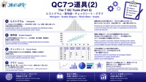
次回の記事では、QC7つ道具の残り4つ「ヒストグラム」、「散布図」、「チェックシート」、「グラフ」について詳しく解説します。QC3合格を目指して、一緒に頑張りましょう!
The next article will provide a detailed explanation of the remaining four tools from the 7 QC Tools: the Histogram, the Scatter Diagram, the Check Sheet, and Graphs. Let us keep working together toward passing the QC Level 3 exam!
練習問題 層別・パレート図・特性要因図の理解を確認しよう Practice Questions | Test Your Understanding of Stratification, Pareto Charts, and Cause-and-Effect Diagrams
ここまで学んだ内容を確認するため、試験形式の練習問題に挑戦してみましょう。解答は各問題の下に記載しています。
To review what you have learned, try the following exam-style practice questions. The answer to each question is provided below it.
問題1 Question 1
層別に関する次の記述のうち、正しいものはどれか。
Which of the following statements about stratification is correct?
- 層別とは、データを件数の多い順に並べ替えて累積比率を求めることである。
Stratification is the process of sorting data in descending order by count and calculating the cumulative percentage. - 層別は単独でのみ使用し、他のQC7つ道具と組み合わせることはできない。
Stratification can only be used independently and cannot be combined with other QC tools. - 層別を行う基準としては、作業者別・機械別・時間帯別・ロット別などがある。
Stratification criteria include grouping by operator, machine, time period, and lot, among others. - 層別は、問題の原因を体系的に整理するための図を作成する手法である。
Stratification is a method for constructing a diagram that systematically organizes the causes of a problem.
解答:3 Answer: 3
層別とは、データを特定の基準で分類・整理する手法です。作業者別、機械別、時間帯別、ロット別などの基準で分けることで、問題の原因が見えてきます。選択肢1はパレート図の説明、選択肢4は特性要因図の説明です。選択肢2は誤りで、層別はパレート図や特性要因図と組み合わせることでより深い分析が可能になります。4M(Man・Machine・Material・Method)も層別の代表的な基準として覚えておきましょう。
Stratification is a method of classifying and organizing data according to specific criteria. Dividing data by criteria such as operator, machine, time period, or lot can bring the cause of a problem to light. Option 1 describes a Pareto Chart; Option 4 describes a Cause-and-Effect Diagram. Option 2 is incorrect — combining stratification with Pareto Charts and Cause-and-Effect Diagrams enables deeper analysis. Also remember that the 4M framework (Man, Machine, Material, Method) represents the most common stratification criteria.
問題2 Question 2
次のデータをもとにパレート図を作成するとき、累積比率が初めて80%を超えるのは何番目の項目までを集計したときか。
When constructing a Pareto Chart from the following data, after accumulating how many items does the cumulative percentage first exceed 80%?
キズ:48件、寸法不良:36件、色ムラ:24件、異物混入:12件
Scratches: 48, Dimensional defects: 36, Uneven coloring: 24, Foreign object contamination: 12
- 1項目目(キズのみ)
After the 1st item (Scratches only) - 2項目目(キズ+寸法不良)
After the 2nd item (Scratches + Dimensional defects) - 3項目目(キズ+寸法不良+色ムラ)
After the 3rd item (Scratches + Dimensional defects + Uneven coloring) - 4項目目(全項目)
After the 4th item (all items)
解答:3 Answer: 3
まず合計件数を求めます。48+36+24+12=120件です。次に件数の多い順に並べ、累積比率を計算します。キズ:48件、累積比率40.0%。キズ+寸法不良:84件、累積比率70.0%。キズ+寸法不良+色ムラ:108件、累積比率90.0%。3項目目で初めて80%を超えます。パレート図では累積比率80%を超える項目までが重点的に対策すべき項目となります。
First, calculate the total: 48 + 36 + 24 + 12 = 120. Next, sort in descending order and calculate the cumulative percentage. Scratches: 48, cumulative percentage 40.0%. Scratches + Dimensional defects: 84, cumulative percentage 70.0%. Scratches + Dimensional defects + Uneven coloring: 108, cumulative percentage 90.0%. The 80% threshold is first exceeded at the 3rd item. In a Pareto Chart, the items up to and including the point where the cumulative percentage exceeds 80% are the ones requiring priority countermeasures.
問題3 Question 3
特性要因図の4Mに関する次の記述のうち、誤っているものはどれか。
Which of the following statements about the 4M framework in a Cause-and-Effect Diagram is incorrect?
- 「Man(人)」には、作業者のスキル不足や疲労などが含まれる。
“Man” includes factors such as insufficient operator skill and fatigue. - 「Machine(機械)」には、金型の摩耗や設備の故障などが含まれる。
“Machine” includes factors such as mold wear and equipment breakdown. - 「Material(材料)」には、生産計画の精度や作業指示の内容などが含まれる。
“Material” includes factors such as the accuracy of production planning and the content of work instructions. - 「Method(方法)」には、作業手順や条件設定のミスなどが含まれる。
“Method” includes factors such as errors in work procedures and condition settings.
解答:3 Answer: 3
Material(材料)に含まれるのは、原材料の品質や保管状態、部品のばらつきなど、製品に使用される材料に関する要因です。生産計画の精度や作業指示の内容は「Management(管理)」に分類されます。選択肢1・2・4はそれぞれ正しい説明です。4Mの内容は試験頻出のため「Man=人に関する要因、Machine=機械・設備、Material=材料・部品、Method=作業方法・手順」と整理して覚えておきましょう。
Material covers factors related to the materials used in the product — such as the quality and storage conditions of raw materials and variation in components. The accuracy of production planning and the content of work instructions are classified under “Management.” Options 1, 2, and 4 are all correct. Since the 4M content is frequently tested, memorize the framework as: Man = factors related to people, Machine = machinery and equipment, Material = materials and components, Method = working methods and procedures.
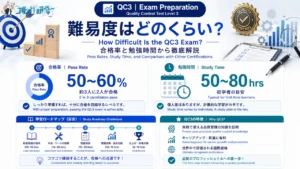
- QC3の難易度は?合格率・勉強時間・他の資格との比較で徹底解説 How Difficult Is the QC3 Exam? Pass Rates, Study Time, and Comparison with Other Certifications
- QC3|QC7つ道具(2) ヒストグラム・散布図・チェックシート・グラフの使い方 QC Level 3 | The 7 QC Tools (Part 2): How to Use Histograms, Scatter Diagrams, Check Sheets, and Graphs
この記事を書いた人
関連記事
-
 QC3|品質の概念・QC的ものの見方・工程管理・小集団活動・QMSの基礎知識をわかりやすく解説 QC Level 3 | Quality Concepts, the QC Way of Thinking, Process Management, Small Group Activities, and QMS Explained
 -
QC3|プロセス保証・方針管理・日常管理の基礎知識をわかりやすく解説 QC Level 3 | Process Assurance, Policy Management, and Daily Management Explained
-
QC3|QCストーリー(問題解決型の8手順・課題達成型の9手順)の違いと使い分けをわかりやすく解説 QC Level 3 | QC Story: 8-Step Problem-Solving vs. 9-Step Task-Achievement Explained
-
QC3|相関係数の計算方法・性質・使用上の注意点をわかりやすく解説 QC Level 3 | Correlation Coefficient: Calculation, Properties, and Key Cautions Explained
-
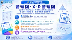
QC3|管理図の考え方とX̄-R管理図の計算方法をわかりやすく解説 QC Level 3 | Control Charts and X̄-R Chart Calculations Explained
-
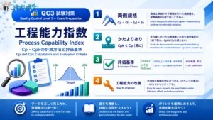
QC3|工程能力指数 Cp・Cpkの計算方法と評価基準 QC Level 3 | Process Capability Index: Cp and Cpk Calculation and Evaluation Criteria
-
QC3|QC7つ道具(2) ヒストグラム・散布図・チェックシート・グラフの使い方 QC Level 3 | The 7 QC Tools (Part 2): How to Use Histograms, Scatter Diagrams, Check Sheets, and Graphs
-
QC3の難易度は?合格率・勉強時間・他の資格との比較で徹底解説 How Difficult Is the QC3 Exam? Pass Rates, Study Time, and Comparison with Other Certifications