QC3|管理図の考え方とX̄-R管理図の計算方法をわかりやすく解説 QC Level 3 | Control Charts and X̄-R Chart Calculations Explained
QC3の試験において、「管理図」は出題頻度・配点ともに高い最重要テーマのひとつです。計算問題・概念問題の両方で問われますが、仕組みと手順を順序よく理解すれば、確実に得点できる分野です。この記事では、管理図の基本的な考え方から、X̄-R管理図の計算手順・管理図の読み方・p管理図とnp管理図の違いまで、試験合格に必要な知識を体系的にわかりやすく解説します。
In the QC Level 3 exam, control charts are one of the most important topics, appearing frequently and carrying significant weight in both calculation and concept questions. Once you understand the basic principles and the step-by-step procedure, this is an area where you can reliably score points. This article covers everything you need for the exam: the basic principles of control charts, the calculation procedure for X̄-R charts, how to read a control chart, and the difference between p charts and np charts.
目次
管理図とは何か What Is a Control Chart?
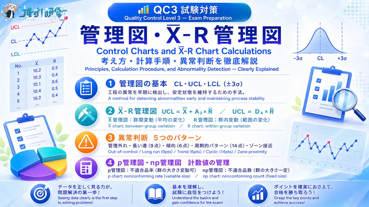
管理図とは、工程(プロセス)の状態を時系列で追跡し、異常の発生を早期に検出して工程を安定した状態に保つために使う図です。横軸に時間(群の番号)、縦軸に品質特性値をとり、折れ線グラフで工程の変化を可視化します。
A control chart is a chart used to track the state of a process over time, detect abnormalities early, and keep the process in a stable condition. The horizontal axis represents time (group number) and the vertical axis represents the quality characteristic being measured, with process changes visualized as a line graph.
管理図の3本の線 The Three Lines of a Control Chart
管理図には、以下の3本の管理線が引かれます。
A control chart has three control lines drawn on it.
| 記号 / Symbol | 名称 / Name | 意味 / Meaning |
|---|---|---|
| CL | 中心線 / Center Line | 全データまたは各群の統計量の平均を示す水平な基準線 A horizontal reference line representing the average of all data or subgroup statistics |
| UCL | 上側管理限界線 / Upper Control Limit | 工程の安定を確認するための上限基準線 Upper boundary line for confirming process stability |
| LCL | 下側管理限界線 / Lower Control Limit | 工程の安定を確認するための下限基準線 Lower boundary line for confirming process stability |
管理限界線(UCLとLCL)は、基本的に中心線から約3σに相当する位置に設定されます。X̄-R管理図では標準偏差を直接計算する代わりに、係数表のA₂・D₃・D₄を用いて管理限界線を算出します。工程が安定している状態では、全データのおよそ99.7%がUCLとLCLの間に収まります。
Control limits (UCL and LCL) are generally set at positions corresponding to approximately ±3σ from the center line. In X̄-R charts, instead of calculating the standard deviation directly, coefficients A₂, D₃, and D₄ from the coefficient table are used to determine the control limits. When a process is stable, approximately 99.7% of all data points fall between the UCL and LCL.
「群」とは What Is a “Group”?
管理図で頻繁に登場する「群」とは、工程から同じタイミングでまとめてサンプリングしたデータのひとまとまりのことです。群に関係する2つの用語を区別して覚えてください。
The term “group” (群), which appears frequently in control chart discussions, refers to a set of data sampled from the process at the same point in time. Make sure you can distinguish between the following two terms.
| 用語 / Term | 意味 / Meaning | 例 / Example |
|---|---|---|
| 群の大きさ(n) Group size | 1回のサンプリングで取るデータの個数 Number of measurements taken in one sample | 1回に4個測定 → n = 4 4 measurements per sample → n = 4 |
| 群の数 Number of groups | サンプリングを行った回数(管理図の点の数) Number of times sampling was conducted (= number of points on the chart) | 15回分のデータ → 群の数 = 15 Data from 15 sessions → 15 groups |
管理図の種類 Types of Control Charts
QC3の試験で出題される管理図は、扱うデータの種類によって以下のように分類されます。
The control charts covered in the QC Level 3 exam are classified as follows based on the type of data they handle.
| データの種類 / Data Type | 管理図の種類 / Chart Type |
|---|---|
| 計量値(長さ・重さなど連続的な数値) Measured values (continuous data such as length, weight) | X̄-R管理図(最も出題頻度が高い) X̄-R chart (most frequently tested) |
| 計数値(不適合品の数・率など) Count values (number or rate of nonconforming items) | p管理図・np管理図 p chart / np chart |
X̄-R管理図の仕組みと計算手順 How X̄-R Charts Work and How to Calculate Them
X̄管理図とR管理図の役割 The Role of X̄ and R Charts
X̄-R管理図は、X̄管理図とR管理図を組み合わせて使用する管理図です。それぞれが監視する対象が異なります。
The X̄-R chart is a combination of two charts used together. Each monitors a different aspect of the process.
| 管理図 / Chart | 監視対象 / What It Monitors | 変動の種類 / Type of Variation |
|---|---|---|
| X̄管理図 | 各群の平均値の変化 Changes in the mean of each group | 群間変動(群と群のあいだのばらつき) Between-group variation |
| R管理図 | 各群の範囲(最大値-最小値)の変化 Changes in the range (max − min) of each group | 群内変動(1つの群のなかのばらつき) Within-group variation |
計算手順 Calculation Procedure
X̄-R管理図の計算は、以下の6つのステップで行います。係数表は問題冊子に掲載されているため、暗記は不要です。
The X̄-R chart is calculated in the following six steps. The coefficient table is provided in the exam booklet, so memorization is not required.
STEP 1:群の大きさ n と群の数を確認する
STEP 1: Confirm the group size n and the number of groups
データシートから、1回のサンプリングで測定した個数(n)と、サンプリングの回数(群の数)を確認します。
From the data sheet, confirm the number of measurements per sample (n) and the number of sampling sessions (number of groups).
STEP 2:X̄管理図の中心線(CL)を計算する
STEP 2: Calculate the center line (CL) for the X̄ chart
X̄̄ = X̄管理図のCL = 各群の平均値 X̄ の合計 / Sum of group means (X̄) 群の数 / Number of groups
STEP 3:R管理図の中心線(CL)を計算する
STEP 3: Calculate the center line (CL) for the R chart
R̄ = R管理図のCL = 各群の範囲 R の合計 / Sum of group ranges 群の数 / Number of groups
STEP 4:係数表から群の大きさ n の行の係数を選ぶ
STEP 4: Select the coefficients for the row corresponding to group size n from the coefficient table
| n | A₂ | D₃ | D₄ |
|---|---|---|---|
| 2 | 1.880 | — | 3.267 |
| 3 | 1.023 | — | 2.575 |
| 4 | 0.729 | — | 2.282 |
| 5 | 0.577 | — | 2.114 |
| 6 | 0.483 | — | 2.004 |
| 7 | 0.419 | 0.076 | 1.924 |
| 8 | 0.373 | 0.136 | 1.864 |
| 9 | 0.337 | 0.184 | 1.816 |
| 10 | 0.308 | 0.223 | 1.777 |
※ D₃が「—」の場合(n≦6)、R管理図のLCLは0として扱い、下側管理限界線は表示しません。UCLのみを算出します。
※ When D₃ is “—” (n ≤ 6), the LCL for the R chart is treated as 0 and is not displayed. Only the UCL is determined.
STEP 5:X̄管理図の管理限界線(UCLとLCL)を計算する
STEP 5: Calculate the control limits (UCL and LCL) for the X̄ chart
UCL = X̄̄ + A₂ × R̄ LCL = X̄̄ − A₂ × R̄
STEP 6:R管理図の管理限界線(UCLとLCL)を計算する
STEP 6: Calculate the control limits (UCL and LCL) for the R chart
UCL = D₄ × R̄ LCL = D₃ × R̄(D₃が「—」の場合はLCLなし / No LCL when D₃ is “—”)

管理図の読み方——工程の異常を見抜く How to Read a Control Chart: Detecting Process Abnormalities
管理図を分析する際は、まず管理限界線の外側に点がないかを確認します。次に、点がすべて管理限界線の内側に収まっていても、点の並び方に系統的な偏りが見られる場合は工程が異常であると判断します。以下の5つのパターンが試験で問われます。
When analyzing a control chart, first check whether any points fall outside the control limits. Even when all points remain within the limits, a process is judged to be abnormal if there is a nonrandom pattern in the plotted points. The following five patterns are tested in the exam.
| パターン / Pattern | 判断基準 / Criterion |
|---|---|
| ①管理限界線を超える点 Point outside control limits | UCLまたはLCLの外側に1点でも出れば異常 Any single point outside UCL or LCL signals an abnormality |
| ②長い連 Long run | 中心線に対して同じ側に9点以上連続して現れる 9 or more consecutive points on the same side of the center line |
| ③傾向 Trend | 6点以上が連続して増加または減少し続ける 6 or more consecutive points continuously increasing or decreasing |
| ④周期 Cyclic Pattern | 14点以上が交互に増減を繰り返す 14 or more points alternating up and down |
| ⑤中心線近接・管理限界線接近 Proximity to CL or Control Limits | 連続する3点中2点がゾーンA(2σ〜3σの領域)またはそれを超えた領域にある、連続する5点中4点以上がゾーンBまたはそれを超える領域(ゾーンB:1σ〜2σの領域)にある、連続する15点が中心線から1σ以内の領域(ゾーンC)にある、など Examples: 2 of 3 consecutive points in Zone A or beyond (Zone A: 2σ–3σ region); 4 or more of 5 consecutive points in Zone B or beyond (Zone B: 1σ–2σ region); 15 consecutive points within 1σ of the center line (Zone C) |
管理図の分析では、「管理外れ」と点の並び方の系統的な偏りという2種類の異常を見分けることが基本です。試験では管理図のグラフを見て、どのパターンの異常が発生しているかを判断する問題が出題されます。各パターンの視覚的なイメージをつかんでおくことが重要です。
The foundation of control chart analysis is distinguishing between two types of abnormality: out-of-control points and nonrandom patterns in the plotted data. The exam presents control chart graphs and asks you to identify which type of abnormality is occurring. It is essential to build a clear visual image of each pattern.
p管理図とnp管理図 p Charts and np Charts
p管理図とnp管理図は、いずれも計数値(不適合品に関するデータ)を管理するための管理図です。両者の違いは、管理する対象と群の大きさの扱い方にあります。
Both the p chart and the np chart are control charts used to manage count data related to nonconforming items. The difference between them lies in what they monitor and how group size is handled.
| 管理図 / Chart | 管理対象 / What It Monitors | 群の大きさ / Group Size | 管理限界線 / Control Limits |
|---|---|---|---|
| p管理図 | 不適合品率(割合) Nonconforming item rate | 変動する(群ごとに異なってよい) Variable (may differ per group) | 群ごとに別々に計算する Calculated separately for each group |
| np管理図 | 不適合品数(個数) Nonconforming item count | 一定(全群で同じ) Fixed (same for all groups) | 全群で共通の管理限界線を使う Same control limits applied to all groups |
p管理図とnp管理図は、どちらも二項分布を理論的な基礎とする管理図です。試験では詳細な計算よりも、「p管理図は不適合品率・np管理図は不適合品数」という対応関係と、群の大きさの扱いの違いが問われます。
Both the p chart and the np chart are theoretically grounded in the binomial distribution. Rather than detailed calculations, the exam tests the correspondence — “p chart monitors rate; np chart monitors count” — and the difference in how group size is handled.
まとめ Summary
- 管理図は工程の異常を見つけ安定状態を維持するための手法。CL・UCL・LCLの3本の管理線で構成される
Control charts are a method for detecting abnormalities and maintaining process stability, consisting of three control lines: CL, UCL, and LCL - 管理限界線は中心線から約±3σの位置に設定。X̄-R管理図では係数A₂・D₃・D₄を使って算出する
Control limits are set at approximately ±3σ from the center line; in X̄-R charts, they are calculated using coefficients A₂, D₃, and D₄ - X̄管理図は群間変動(平均の変化)、R管理図は群内変動(範囲の変化)を管理する
The X̄ chart monitors between-group variation (changes in mean); the R chart monitors within-group variation (changes in range) - 管理限界線の計算式:X̄管理図 UCL/LCL = X̄̄ ± A₂×R̄、R管理図 UCL/LCL = D₄×R̄ / D₃×R̄(n≦6はLCLなし)
Control limit formulas: X̄ chart UCL/LCL = X̄̄ ± A₂×R̄; R chart UCL/LCL = D₄×R̄ / D₃×R̄ (no LCL when n ≤ 6) - 異常の判断パターンは5種類:管理外れ・長い連(9点)・傾向(6点)・周期的パターン(14点)・中心線近接または管理限界線接近
There are 5 types of abnormality patterns: out-of-control, long run (9 points), trend (6 points), cyclic pattern (14 points), proximity to CL or control limits - p管理図は不適合品率(群の大きさ変動可)、np管理図は不適合品数(群の大きさ一定)を管理する
The p chart monitors nonconforming item rate (variable group size); the np chart monitors nonconforming item count (fixed group size)
管理図の考え方と計算手順を確実に身につけることは、QC3試験の得点力を大きく高めます。特に、X̄-R管理図の6ステップの計算手順と5つの異常判断パターンは、繰り返し練習問題を解いて定着させましょう。
Solidly mastering the basic principles and calculation procedures of control charts will significantly boost your QC Level 3 exam score. In particular, practice the six-step X̄-R chart calculation and the five abnormality patterns repeatedly through practice questions until you can apply them confidently.
練習問題 管理図の理解を確認しよう Practice Questions: Test Your Understanding of Control Charts
ここまで学んだ内容を確認するため、試験形式の練習問題に挑戦してみましょう。解答と解説は各問題の直下に記載しています。
To review what you have learned, try the following exam-style practice questions. The answer and explanation for each question are provided directly below it.
問題1 Question 1
管理図に関する次の記述のうち、誤っているものはどれか。
Which of the following statements about control charts is incorrect?
- X̄-R管理図のX̄管理図は、各群の平均値の変化(群間変動)を管理するために使用する。
The X̄ chart in an X̄-R chart is used to monitor changes in the group mean (between-group variation). - X̄-R管理図の管理限界線は、標準偏差を直接求める代わりに、係数表のA₂・D₃・D₄を用いて算出する。
The control limits of an X̄-R chart are calculated using coefficients A₂, D₃, and D₄ from the coefficient table, rather than calculating the standard deviation directly. - p管理図は不適合品数を管理する管理図であり、群の大きさは全群で一定でなければならない。
The p chart is a control chart that monitors the number of nonconforming items, and the group size must be fixed across all groups. - 管理限界線の内側に点が収まっていても、点の並び方に系統的な偏りがあれば工程が異常と判断することがある。
Even when all points fall within the control limits, the process may be judged abnormal if there is a nonrandom pattern in the arrangement of points.
解答:3 Answer: 3
選択肢3が誤りです。不適合品数を管理し群の大きさが一定なのはnp管理図です。p管理図が管理するのは不適合品率(割合)であり、群の大きさは群ごとに変動してもかまいません。選択肢1はX̄管理図の役割として正しく、R管理図は群内変動(範囲の変化)を管理します。選択肢2はX̄-R管理図の管理限界線の算出方法として正しい記述です。選択肢4は点の並び方による異常判断の正しい説明です。
Option 3 is incorrect. It is the np chart that monitors the number of nonconforming items and requires a fixed group size. The p chart monitors the nonconforming item rate (proportion), and the group size may vary from group to group. Option 1 correctly describes the role of the X̄ chart; the R chart monitors within-group variation (changes in range). Option 2 correctly describes how control limits are calculated for X̄-R charts. Option 4 correctly explains abnormality detection based on nonrandom patterns in plotted points.
問題2 Question 2
群の大きさ n = 5、群の数 = 20 のデータを収集し、X̄-R管理図を作成する。全群の平均値 X̄ の合計が 600、全群の範囲 R の合計が 80 であった。X̄管理図の UCL として最も適切な値はどれか。なお、n = 5 のとき A₂ = 0.577 とする。
An X̄-R chart is to be constructed from data with a group size of n = 5 and 20 groups. The sum of all group means X̄ is 600, and the sum of all group ranges R is 80. Which of the following is the most appropriate value for the UCL of the X̄ chart? Use A₂ = 0.577 for n = 5.
- 30.0
- 31.2
- 32.3
- 33.5
解答:3 Answer: 3
まず中心線を計算します。X̄̄ = 600 ÷ 20 = 30.0、R̄ = 80 ÷ 20 = 4.0 です。次にX̄管理図のUCLを計算します。UCL = X̄̄ + A₂ × R̄ = 30.0 + 0.577 × 4.0 = 30.0 + 2.308 ≒ 32.3 となります。X̄管理図のLCLは 30.0 − 2.308 ≒ 27.7 です。計算では①X̄̄とR̄を求める②係数表から係数を選ぶ③公式に代入するという3段階の手順を確実に踏んでください。
First, calculate the center lines: X̄̄ = 600 ÷ 20 = 30.0 and R̄ = 80 ÷ 20 = 4.0. Next, calculate the UCL for the X̄ chart: UCL = X̄̄ + A₂ × R̄ = 30.0 + 0.577 × 4.0 = 30.0 + 2.308 ≈ 32.3. The LCL for the X̄ chart would be 30.0 − 2.308 ≈ 27.7. Follow these three steps consistently: ① calculate X̄̄ and R̄; ② select the appropriate coefficients from the table; ③ substitute into the formula.
問題3 Question 3
管理図の異常判断に関する次の記述のうち、正しいものはどれか。
Which of the following statements about detecting abnormalities in a control chart is correct?
- 中心線に対して同じ側に7点以上連続して現れた場合、「長い連」として異常と判断する。
When 7 or more consecutive points appear on the same side of the center line, it is judged as a “long run” abnormality. - 点が連続して増加または減少している傾向が5点以上続く場合、「傾向」として異常と判断する。
When a trend of continuously increasing or decreasing points continues for 5 or more points, it is judged as a “trend” abnormality. - 管理限界線の外側に点が1点も出ていなければ、点の並び方に系統的な偏りがあっても工程は安定していると判断する。
If no points fall outside the control limits, the process is judged to be stable even if there is a nonrandom pattern in the arrangement of points. - 点が交互に増減を繰り返すパターンが14点以上続く場合、周期的パターンとして異常と判断する。
When a cyclic pattern of alternating increases and decreases continues for 14 or more points, it is judged as an abnormality.
解答:4 Answer: 4
選択肢4が正しい記述です。14点以上の交互増減が続く場合は周期的パターンとして工程に異常があると判断します。選択肢1は誤りで、「長い連」の判断基準は7点ではなく9点以上です。選択肢2も誤りで、「傾向」の判断基準は5点ではなく6点以上の連続増加または減少です。選択肢3は誤りで、管理限界線内に点が収まっていても点の並び方に系統的な偏りがある場合は異常と判断します。管理図の分析では「管理外れ」と点の並び方の系統的な偏りという2種類の異常を必ず確認することが重要です。
Option 4 is correct. When alternating increases and decreases continue for 14 or more points, it is identified as a cyclic pattern and the process is judged to be abnormal. Option 1 is incorrect: the criterion for a “long run” is 9 or more points on the same side, not 7. Option 2 is also incorrect: the criterion for a “trend” is 6 or more consecutive points of continuous increase or decrease, not 5. Option 3 is incorrect: even when all points remain within the control limits, an abnormality is identified if there is a nonrandom pattern in the plotted points. When analyzing a control chart, it is essential to check for both types of abnormality — out-of-control points and nonrandom patterns in the plotted points.
- 危険物乙4|免状の交付・書換え・再交付の申請先と手続きをわかりやすく解説 Class B Group 4 Hazardous Materials Engineer | License Issuance, Amendment, Reissuance, and Surrender: Application Authorities and Procedures Explained
- 日商簿記3級|預金と当座借越の仕訳 Nissho Bookkeeping Level 3 | Deposits and Bank Overdraft Journal Entries
この記事を書いた人
関連記事
-
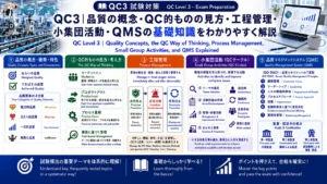
 QC3|品質の概念・QC的ものの見方・工程管理・小集団活動・QMSの基礎知識をわかりやすく解説 QC Level 3 | Quality Concepts, the QC Way of Thinking, Process Management, Small Group Activities, and QMS Explained
 -
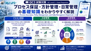
QC3|プロセス保証・方針管理・日常管理の基礎知識をわかりやすく解説 QC Level 3 | Process Assurance, Policy Management, and Daily Management Explained
-
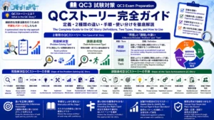
QC3|QCストーリー(問題解決型の8手順・課題達成型の9手順)の違いと使い分けをわかりやすく解説 QC Level 3 | QC Story: 8-Step Problem-Solving vs. 9-Step Task-Achievement Explained
-
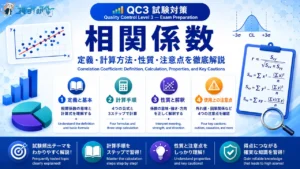
QC3|相関係数の計算方法・性質・使用上の注意点をわかりやすく解説 QC Level 3 | Correlation Coefficient: Calculation, Properties, and Key Cautions Explained
-
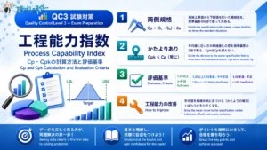
QC3|工程能力指数 Cp・Cpkの計算方法と評価基準 QC Level 3 | Process Capability Index: Cp and Cpk Calculation and Evaluation Criteria
-
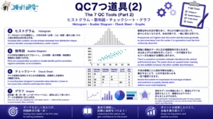
QC3|QC7つ道具(2) ヒストグラム・散布図・チェックシート・グラフの使い方 QC Level 3 | The 7 QC Tools (Part 2): How to Use Histograms, Scatter Diagrams, Check Sheets, and Graphs
-
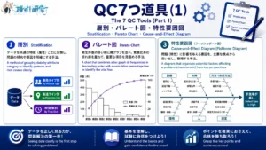
QC3|QC7つ道具(1)層別・パレート図・特性要因図の使い方 QC Level 3 | The 7 QC Tools (Part 1): How to Use Stratification, Pareto Charts, and Cause-and-Effect Diagrams
-
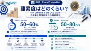
QC3の難易度は?合格率・勉強時間・他の資格との比較で徹底解説 How Difficult Is the QC3 Exam? Pass Rates, Study Time, and Comparison with Other Certifications