QC3|QC7つ道具(2) ヒストグラム・散布図・チェックシート・グラフの使い方 QC Level 3 | The 7 QC Tools (Part 2): How to Use Histograms, Scatter Diagrams, Check Sheets, and Graphs
前回の記事(QC7つ道具(1))では、層別・パレート図・特性要因図の3つを解説しました。今回はその続きとして、残り4つのツール「ヒストグラム」「散布図」「チェックシート」「グラフ」を取り上げます。
In the previous article (The 7 QC Tools, Part 1), we covered three tools: Stratification, the Pareto Chart, and the Cause-and-Effect Diagram. This article continues with the remaining four tools: the Histogram, the Scatter Diagram, the Check Sheet, and Graphs.
QC3の試験では、QC7つ道具に関する問題が手法分野の中核をなしており、各ツールの特徴・使い方・読み取り方を正確に理解しておくことが合格の鍵となります。それぞれのツールについて、試験頻出ポイントを中心に解説します。
In the QC Level 3 exam, questions on the 7 QC Tools form the core of the Methods section, and accurately understanding the characteristics, applications, and interpretation of each tool is the key to passing. This article focuses on the most frequently tested points for each tool.
目次
ヒストグラム|データのばらつきを視覚化する Histogram | Visualizing Data Variation
ヒストグラムとは何か What Is a Histogram?
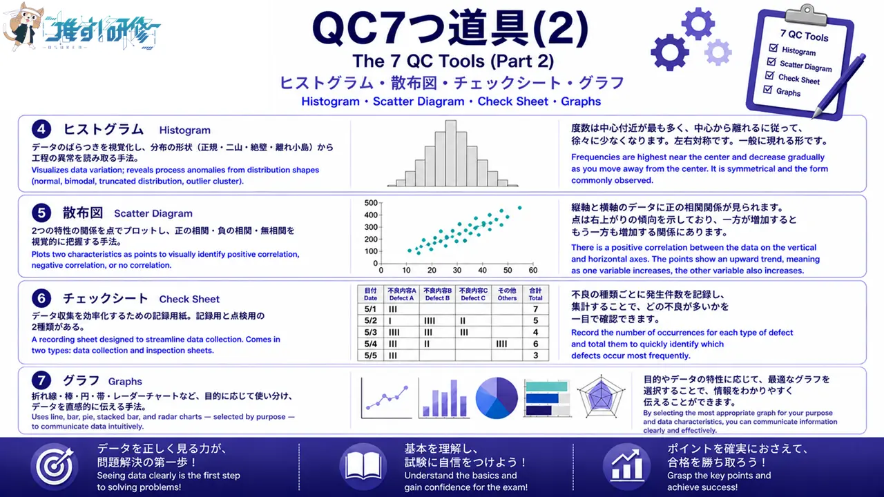
ヒストグラムとは、データの分布(ばらつきの状態)を視覚的に把握するための棒グラフです。横軸にデータの値(寸法・重量・温度など)、縦軸に度数(データの個数)をとり、データがどの範囲に集中しているかを一目で確認できます。製造現場では、製品の寸法や重量のばらつきを把握し、規格外品の発生状況を確認するために広く活用されています。
A Histogram is a bar graph used to visually understand the distribution (state of variation) of data. The horizontal axis represents data values (dimensions, weight, temperature, etc.) and the vertical axis represents frequency (the number of data points), making it possible to see at a glance which range the data is concentrated in. In manufacturing settings, it is widely used to understand variation in product dimensions and weight, and to confirm the occurrence of out-of-specification items.
作り方の手順(階級・度数・級幅) Construction Procedure (Class, Frequency, Class Width)
ヒストグラムを作成する際は、まずデータの最大値と最小値を確認し、範囲(レンジ)を求めます。次に、データ数に応じた階級数を決定します。一般的にデータ数が50〜100個の場合は6〜10階級程度が目安です。範囲を階級数で割った値が級幅となります。各階級に含まれるデータ数(度数)を数えて度数表を作成し、それをもとに棒グラフを描きます。
To construct a Histogram, first confirm the maximum and minimum values in the data and calculate the range. Next, determine the number of classes appropriate to the volume of data — a general guideline is 6 to 10 classes for data sets of 50 to 100 points. Dividing the range by the number of classes gives the class width. Count the number of data points in each class (the frequency) to create a frequency table, then use this to draw the bar graph.
形状から読み取れること What the Shape Reveals
ヒストグラムの形状は、工程の状態を反映しています。左右対称の山形(釣鐘型)は正常な状態を示し、データが規格内に収まっていれば工程は安定していると判断できます。一方、二つの山がある「二山型」は、異なる条件(機械・材料・作業者など)のデータが混在している可能性を示唆しており、層別による原因追究が必要です。また、規格値付近でデータが急に減少する「絶壁型」は、全数検査による選別が行われている可能性があります。さらに、分布から大きく外れた位置に単独で存在する「離れ小島」は、異常値や測定ミスの可能性を示します。
The shape of a Histogram reflects the state of the process. A symmetrical bell shape (normal distribution) indicates a normal state; if the data falls within specifications, the process can be judged as stable. A bimodal shape with two peaks suggests that data from different conditions (machine, material, operator, etc.) may be mixed together, requiring stratification to identify the cause. A truncated distribution where data drops sharply near a specification limit may indicate that 100% inspection and sorting has been carried out. An outlier cluster — a group of data points appearing far from the main distribution — indicates the possibility of abnormal values or measurement errors.
QC3での頻出ポイント Key Points Frequently Tested in QC Level 3
試験では、ヒストグラムの形状(正規分布型・二山型・絶壁型・離れ小島型)とその意味を問う問題が頻出です。また、級幅の計算方法や、規格線との比較による工程能力の判断も出題されます。「ヒストグラムは計量値データに使用する」という点も押さえておきましょう。
Questions asking about Histogram shapes (normal distribution, bimodal, skewed edge, outlier cluster) and their meaning are frequently tested. Questions on how to calculate class width and how to assess process capability by comparing data against specification limits also appear. Also remember that “Histograms are used with variable data.”
散布図|2つの特性の関係を明らかにする Scatter Diagram | Revealing the Relationship Between Two Characteristics
散布図とは何か What Is a Scatter Diagram?
散布図とは、2つの特性(変数)の関係性を視覚的に把握するための図です。横軸に一方の特性、縦軸にもう一方の特性をとり、対になったデータを点でプロットします。製造現場では、「温度と不良率の関係」「原材料の成分と製品強度の関係」など、原因と結果の関係を探る際に活用されます。
A Scatter Diagram is a diagram used to visually understand the relationship between two characteristics (variables). One characteristic is plotted on the horizontal axis and the other on the vertical axis, with paired data points plotted as dots. In manufacturing settings, it is used to explore cause-and-effect relationships such as “the relationship between temperature and defect rate” or “the relationship between raw material composition and product strength.”
正の相関・負の相関・無相関の見分け方 How to Distinguish Positive, Negative, and No Correlation
散布図では、プロットされた点の散らばり方から相関関係を判断します。点が右上がりに並んでいる場合は「正の相関」(一方が増えるともう一方も増える)、右下がりに並んでいる場合は「負の相関」(一方が増えるともう一方は減る)、点が無秩序に散らばっている場合は「無相関」(関係がない)と判断します。ただし、相関関係があっても因果関係があるとは限らない点に注意が必要です。
In a Scatter Diagram, the correlation is determined from the pattern of the plotted points. When the points trend upward to the right, this indicates “positive correlation” (as one variable increases, so does the other). When they trend downward to the right, this indicates “negative correlation” (as one increases, the other decreases). When the points are scattered without any pattern, this indicates “no correlation” (no relationship). It is important to note, however, that the presence of a correlation does not necessarily imply a causal relationship.
層別散布図への応用 Application: Stratified Scatter Diagrams
散布図全体では相関が見られない場合でも、データを機械別・作業者別・時間帯別などに層別してプロットし直すと、層ごとに明確な相関が現れることがあります。これを層別散布図といい、問題の原因を特定する強力な手段となります。
Even when the overall Scatter Diagram shows no apparent correlation, re-plotting the data stratified by machine, operator, or time period may reveal a clear correlation within each stratum. This is called a stratified scatter diagram and is a powerful means of identifying the root cause of a problem.
QC3試験での頻出ポイント Key Points Frequently Tested in QC Level 3
試験では、散布図の形状から相関の種類(正・負・無相関)を判断する問題が頻出です。また、「相関係数が1に近いほど強い正の相関」「相関係数が-1に近いほど強い負の相関」「相関係数が0に近いほど無相関」という関係も出題されます。相関関係と因果関係の違いについても理解しておくことが重要です。
Questions asking you to determine the type of correlation (positive, negative, or none) from a Scatter Diagram shape are frequently tested. The following relationships are also tested: “the closer the correlation coefficient is to 1, the stronger the positive correlation,” “the closer it is to −1, the stronger the negative correlation,” and “the closer it is to 0, the less the correlation.” Understanding the difference between correlation and causation is also important.

チェックシート|データ収集を効率化する Check Sheet | Streamlining Data Collection
チェックシートとは何か What Is a Check Sheet?
チェックシートとは、データを簡単かつ正確に記録・集計するために、あらかじめ記入項目を整理した用紙(またはフォーム)です。QC7つ道具の中では最もシンプルなツールですが、データ収集の効率化と記録ミスの防止という点で、品質管理の現場で欠かせない役割を果たしています。
A Check Sheet is a form (or sheet) with pre-organized recording items, designed to make it easy and accurate to record and tally data. It is the simplest tool among the 7 QC Tools, but it plays an indispensable role in quality control settings by streamlining data collection and preventing recording errors.
記録用と点検用の2種類 Two Types: Data Collection and Inspection
チェックシートには大きく2種類あります。記録用チェックシートは、不良の種類・発生箇所・発生時刻などのデータを記録・集計するためのもので、パレート図や散布図を作成する際のデータ収集にも活用されます。一方、点検用チェックシートは、作業手順や設備点検の実施確認を目的としたもので、確認すべき項目をリスト化し、実施済みの項目にチェックを入れていく形式です。
There are two main types of Check Sheet. The data collection Check Sheet is used to record and tally data such as defect type, location of occurrence, and time of occurrence; it is also used for data collection when constructing Pareto Charts and Scatter Diagrams. The inspection Check Sheet, on the other hand, is designed to confirm that work procedures and equipment inspections have been carried out; it lists the items to be checked and involves marking each item as it is completed.
設計のポイント Key Points for Designing a Check Sheet
チェックシートを設計する際は、目的(何のためにデータを収集するか)を明確にし、記入が簡単でミスが起きにくい形式にすることが重要です。また、誰が・いつ・どこで記録したかを明確にするための記入欄(日付・担当者・工程名など)を設けることも大切です。
When designing a Check Sheet, it is important to clearly define the purpose (what data is being collected and why) and to create a format that is easy to fill in with minimal risk of error. It is also important to include fields that clearly identify who recorded the data, when, and where (such as date, person responsible, and process name).
QC3試験での頻出ポイント Key Points Frequently Tested in QC Level 3
試験では、記録用チェックシートと点検用チェックシートの違いを問う問題が出題されます。また、「チェックシートはデータ収集の段階で使用するツールである」という位置づけと、他のQC7つ道具(特にパレート図・ヒストグラム)との関連性も押さえておきましょう。
Questions asking about the difference between data collection and inspection Check Sheets appear in the exam. Also remember the Check Sheet’s role as “a tool used at the data collection stage,” and its relationship to other QC tools — particularly the Pareto Chart and the Histogram.
グラフ|データを直感的に伝える Graphs | Communicating Data Intuitively
QC3で押さえるべきグラフの種類 Types of Graphs to Know for QC Level 3
グラフは、データを視覚的に表現し、傾向・比較・構成比などを直感的に伝えるためのツールです。QC3の試験では、複数のグラフの種類とその使い分けが問われます。主要なグラフとして、折れ線グラフ・棒グラフ・円グラフ・帯グラフ・レーダーチャート(クモの巣グラフ)を押さえておく必要があります。
Graphs are tools for expressing data visually and communicating trends, comparisons, and proportions intuitively. The QC Level 3 exam tests knowledge of multiple graph types and when to use each. The key graphs to know are: line graph, bar graph, pie chart, stacked bar chart, and radar chart (spider chart).
グラフの種類と使い分け Types of Graphs and When to Use Each
折れ線グラフは、時間の経過に伴うデータの変化(推移)を表すのに適しており、不良率の月別推移などに使用されます。棒グラフは、複数の項目間の数値を比較するのに適しており、工程別の不良件数比較などに活用されます。円グラフは、全体に対する各項目の構成比(割合)を表すのに適しています。帯グラフも構成比を表しますが、複数の時期や条件の構成比を並べて比較する場合に有効です。レーダーチャート(クモの巣グラフ)は、複数の評価項目のバランスを視覚的に比較するのに適しており、製品の品質特性の比較などに使用されます。
The line graph is suited to showing changes in data over time (trends) and is used for applications such as monthly trends in defect rates. The bar graph is suited to comparing numerical values across multiple categories and is used for applications such as comparing defect counts by process. The pie chart is suited to showing the proportion (percentage) of each category relative to the whole. The stacked bar chart also shows proportions, but is particularly effective when comparing proportions across multiple time periods or conditions side by side. The radar chart (spider chart) is suited to visually comparing the balance of multiple evaluation criteria and is used for applications such as comparing quality characteristics across products.
QC3試験での頻出ポイント Key Points Frequently Tested in QC Level 3
試験では、各グラフの特徴と適切な使用場面を問う問題が出題されます。特に「時系列データには折れ線グラフ」「構成比には円グラフまたは帯グラフ」「複数項目の比較にはレーダーチャート」という使い分けの原則を確実に押さえておきましょう。
Questions asking about the characteristics of each graph type and the appropriate situations in which to use them appear in the exam. In particular, make sure you have a solid grasp of the following principles: “time-series data → line graph,” “proportions → pie chart or stacked bar chart,” and “comparing multiple criteria → radar chart.”
QC7つ道具まとめ|7つの使い分けポイント Summary of the 7 QC Tools | Key Points for Choosing the Right Tool
パート1との対応関係と全体像 Connection to Part 1 and the Overall Picture
パート1で解説した層別・パレート図・特性要因図と、今回のヒストグラム・散布図・チェックシート・グラフを合わせた7つが、QC7つ道具の全体像です。これらは問題解決の各段階で組み合わせて使用されます。まずチェックシートでデータを収集し、ヒストグラムやグラフでデータの分布や推移を把握します。次にパレート図で重点課題を特定し、層別や散布図で原因を絞り込みます。最後に特性要因図で根本原因を体系的に整理する、という流れが典型的な活用例です。
The full picture of the 7 QC Tools consists of the three tools covered in Part 1 — Stratification, the Pareto Chart, and the Cause-and-Effect Diagram — together with the four covered in this article: the Histogram, the Scatter Diagram, the Check Sheet, and Graphs. These tools are used in combination at different stages of problem solving. A typical workflow is: first collect data using a Check Sheet; then use a Histogram and Graphs to understand data distribution and trends; next use a Pareto Chart to identify priority issues, and Stratification and Scatter Diagrams to narrow down the causes; and finally use a Cause-and-Effect Diagram to systematically organize the root causes.
問題解決のどの場面でどのツールを使うか Which Tool to Use at Each Stage of Problem Solving
QC3の試験では、「この場面で使うべきツールはどれか」という形式の問題が出題されます。データ収集段階ではチェックシート、現状把握段階ではヒストグラム・グラフ・パレート図、原因分析段階では特性要因図・散布図・層別、という対応関係を整理しておくことが重要です。
The QC Level 3 exam includes questions in the format “which tool should be used in this situation?” It is important to organize the following correspondence: Check Sheet for the data collection stage; Histogram, Graphs, and Pareto Chart for the current situation assessment stage; and Cause-and-Effect Diagram, Scatter Diagram, and Stratification for the cause analysis stage.
まとめ:QC7つ道具をマスターして合格へ Summary: Master the 7 QC Tools and Pass the Exam
今回はQC7つ道具(2)として、ヒストグラム・散布図・チェックシート・グラフの4つを解説しました。重要ポイントを以下に整理します。
This article has covered four tools as Part 2 of the 7 QC Tools: the Histogram, the Scatter Diagram, the Check Sheet, and Graphs. The key points are organized below.
ヒストグラムはデータのばらつきを視覚化し、形状から工程の異常を読み取ります。散布図は2つの特性の相関関係を把握し、正・負・無相関の判断が試験頻出です。チェックシートは記録用と点検用の2種類があり、他のツールへのデータ提供源となります。グラフは種類と使用場面の対応関係を確実に押さえておくことが合格への近道です。
The Histogram visualizes data variation and reveals process anomalies from the shape of the distribution. The Scatter Diagram identifies the correlation between two characteristics, and determining positive, negative, or no correlation is a frequently tested skill. The Check Sheet comes in two types — data collection and inspection — and serves as the data source for other tools. For Graphs, having a solid grasp of the correspondence between graph types and appropriate situations is the most reliable path to passing.
QC7つ道具は単独で使うだけでなく、複数を組み合わせて問題解決のサイクルの中で活用することが重要です。パート1・パート2の内容を合わせて復習し、試験本番に備えてください。
The 7 QC Tools are most powerful not when used individually, but when combined across the problem-solving cycle. Review the content of both Part 1 and Part 2 together to prepare for the actual exam.
練習問題 ヒストグラム・散布図・チェックシート・グラフの理解を確認しよう Practice Questions | Test Your Understanding of Histogram, Scatter Diagram, Check Sheet, and Graphs
ここまで学んだ内容を確認するため、試験形式の練習問題に挑戦してみましょう。解答は各問題の下に記載しています。
To review what you have learned, try the following exam-style practice questions. The answer to each question is provided below it.
問題1 Question 1
ヒストグラムの形状に関する次の記述のうち、正しいものはどれか。
Which of the following statements about Histogram shapes is correct?
- 二山型のヒストグラムは、工程が安定している正常な状態を示す。
A bimodal Histogram indicates a normal, stable process. - 絶壁型のヒストグラムは、全数検査による選別が行われている可能性を示す。
A truncated distribution Histogram suggests the possibility that 100% inspection and sorting has been carried out. - 離れ小島型のヒストグラムは、異なる条件のデータが混在していることを示す。
An outlier cluster Histogram indicates that data from different conditions are mixed together. - 釣鐘型のヒストグラムは、測定ミスや異常値が含まれている可能性を示す。
A bell-shaped Histogram suggests the possibility of measurement errors or abnormal values.
解答:2 Answer: 2
絶壁型は規格値付近でデータが急に減少する形状で、全数検査により規格外品が選別・除外されている可能性を示します。選択肢1は誤りで、二山型は異なる条件(機械・材料・作業者など)のデータが混在していることを示します。選択肢3は誤りで、離れ小島型は分布から外れた単独の点であり、異常値や測定ミスの可能性を示します。選択肢4は誤りで、釣鐘型(左右対称の山形)は正常な状態を示します。各形状とその意味をセットで覚えておきましょう。
A skewed edge shape, where data drops sharply near a specification limit, suggests that out-of-specification items have been sorted and removed through 100% inspection. Option 1 is incorrect: a bimodal shape indicates that data from different conditions (machine, material, operator, etc.) are mixed together. Option 3 is incorrect: an outlier cluster refers to isolated data points far from the main distribution, suggesting the possibility of abnormal values or measurement errors. Option 4 is incorrect: a bell shape (symmetrical) indicates a normal state. Memorize each shape together with its meaning.
問題2 Question 2
散布図に関する次の記述のうち、誤っているものはどれか。
Which of the following statements about Scatter Diagrams is incorrect?
- 散布図は、2つの特性の関係性を視覚的に把握するために使う。
A Scatter Diagram is used to visually understand the relationship between two characteristics. - 点が右上がりに並んでいる場合は、正の相関があると判断する。
When the points trend upward to the right, positive correlation is determined. - 相関関係があれば、必ず因果関係があると判断できる。
If there is a correlation, it can always be concluded that there is a causal relationship. - 相関係数が-1に近いほど、強い負の相関があることを示す。
The closer the correlation coefficient is to −1, the stronger the negative correlation.
解答:3 Answer: 3
相関関係と因果関係は異なります。2つの変数に相関関係が見られても、必ずしも一方が他方の原因であるとは限りません。第三の要因が両方に影響している場合など、見かけ上の相関(疑似相関)が生じることもあります。選択肢1・2・4はいずれも正しい記述です。散布図を読み取る際は「相関関係=因果関係ではない」という点を必ず意識しておきましょう。
Correlation and causation are different things. Even when a correlation is observed between two variables, it does not necessarily mean that one is the cause of the other. In some cases, a third factor may be influencing both, creating a spurious correlation. Options 1, 2, and 4 are all correct. When reading Scatter Diagrams, always keep in mind that “correlation does not equal causation.”
問題3 Question 3
次のデータの表現方法として、最も適切なグラフの組み合わせはどれか。
Which combination of graphs is most appropriate for representing each of the following data?
ア:製品の不良率の月別推移を確認したい
イ:全不良件数に占める各不良種類の割合を確認したい
ウ:複数製品の品質特性(強度・精度・耐久性など)のバランスを比較したい
A: Confirm the monthly trend in the product defect rate
B: Confirm the proportion of each defect type as a share of total defect count
C: Compare the balance of quality characteristics (strength, precision, durability, etc.) across multiple products
- ア:棒グラフ イ:折れ線グラフ ウ:円グラフ
A: Bar graph B: Line graph C: Pie chart - ア:折れ線グラフ イ:円グラフ ウ:レーダーチャート
A: Line graph B: Pie chart C: Radar chart - ア:円グラフ イ:レーダーチャート ウ:棒グラフ
A: Pie chart B: Radar chart C: Bar graph - ア:折れ線グラフ イ:棒グラフ ウ:帯グラフ
A: Line graph B: Bar graph C: Stacked bar chart
解答:2 Answer: 2
時間の経過に伴うデータの推移には折れ線グラフ、全体に対する各項目の構成比(割合)には円グラフ、複数の評価項目のバランス比較にはレーダーチャート(クモの巣グラフ)が最も適しています。グラフの使い分けは「時系列→折れ線」「構成比→円・帯」「複数項目のバランス→レーダーチャート」「項目間の比較→棒グラフ」という対応関係を整理して覚えておきましょう。
A line graph is most suited to showing trends in data over time; a pie chart is most suited to showing the proportion of each category as a share of the whole; and a radar chart (spider chart) is most suited to comparing the balance of multiple evaluation criteria. Memorize the following correspondence for selecting the right graph: “time-series → line graph,” “proportions → pie chart or stacked bar chart,” “balance across multiple criteria → radar chart,” and “comparison across categories → bar graph.”
- QC3|QC7つ道具(1)層別・パレート図・特性要因図の使い方 QC Level 3 | The 7 QC Tools (Part 1): How to Use Stratification, Pareto Charts, and Cause-and-Effect Diagrams
- 危険物乙4「運搬の基準」完全まとめ|試験頻出ポイントを徹底解説 Class B, Group 4 — Complete Guide to Hazardous Materials Transportation Standards | Key Exam Points Explained
この記事を書いた人
関連記事
-
 QC3|品質の概念・QC的ものの見方・工程管理・小集団活動・QMSの基礎知識をわかりやすく解説 QC Level 3 | Quality Concepts, the QC Way of Thinking, Process Management, Small Group Activities, and QMS Explained
 -
QC3|プロセス保証・方針管理・日常管理の基礎知識をわかりやすく解説 QC Level 3 | Process Assurance, Policy Management, and Daily Management Explained
-
QC3|QCストーリー(問題解決型の8手順・課題達成型の9手順)の違いと使い分けをわかりやすく解説 QC Level 3 | QC Story: 8-Step Problem-Solving vs. 9-Step Task-Achievement Explained
-
QC3|相関係数の計算方法・性質・使用上の注意点をわかりやすく解説 QC Level 3 | Correlation Coefficient: Calculation, Properties, and Key Cautions Explained
-
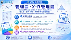
QC3|管理図の考え方とX̄-R管理図の計算方法をわかりやすく解説 QC Level 3 | Control Charts and X̄-R Chart Calculations Explained
-
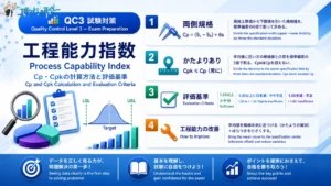
QC3|工程能力指数 Cp・Cpkの計算方法と評価基準 QC Level 3 | Process Capability Index: Cp and Cpk Calculation and Evaluation Criteria
-
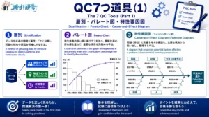
QC3|QC7つ道具(1)層別・パレート図・特性要因図の使い方 QC Level 3 | The 7 QC Tools (Part 1): How to Use Stratification, Pareto Charts, and Cause-and-Effect Diagrams
-
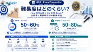
QC3の難易度は?合格率・勉強時間・他の資格との比較で徹底解説 How Difficult Is the QC3 Exam? Pass Rates, Study Time, and Comparison with Other Certifications